UNICEF’s monthly supporters, known as Global Parents, are critical to allow UNICEF to be able to plan ahead and continue to provide support to children in need all around the world. Following a redesign with mixed results, UNICEF were looking to increase engagement and conversion rates on their website.
I worked with the UNICEF team to establish a set of research objectives, identify opportunities through interviews and a usability study, and implement solutions.
For every child
- UNICEF Australia
- Research Strategy, User Interviews, Usability Testing, Expert Review, A/B Testing
Velvet Onion / Oppo Studio
UNICEF (the United Nations Children’s Fund) is a leading global humanitarian and development agency working for the survival, protection, and development of children worldwide through fundraising, advocacy, education and international development programs.
In 2018, UNICEF supported the world's children in 285 humanitarian situations, helping 43 million people access safe water, 7 million children access schooling, and vaccinating 20 million children against measles.

Our objective
As a not-for-profit organisation, UNICEF relies heavily on the support of the community in order to fund these programs via once-off as well as recurring donations from a passionate group of supporters called Global Parents.
UNICEF’s website, which plays a key role in securing these donations, had recently undergone a redesign with mixed results.
UNICEF contacted Velvet Onion to conduct a review of the website, identifying opportunities to increase the new website's engagement and conversion rates. This relationship was continued, with Oppo Studio engaged to implement and iterate on design solutions, guiding the UNICEF team through a series of A/B tests.
My role
As Velvet Onion’s Experience Director, I worked with the UNICEF team to establish a set of research objectives, leading Velvet Onion’s design team through a series of interviews and usability testing sessions.
At Oppo Studio, I worked with the UNICEF team to formulate a design strategy, forming hypotheses along with a set of metrics for each opportunity we explored.
Approach
We planned and conducted a series of interviews and a usability study with the objective of identifying common behavioural patterns in a donors interactions with a charity, and assessing the ability of the UNICEF website to support a donor in a number of common tasks (for example, communicating information about a key, recent crisis, and making a donation).
Participants were recruited from UNICEF Australia’s Facebook page - a key source of donations made through the website - ensuring that participants were familiar with UNICEF without requiring that they be active donors.
From this study, along with an expert review of the donation experience of a number of similar organisations, we presented our findings, including opportunities identified along with a series of recommendations to increase the website’s engagement and conversion rates. This included recommendations on how to better communicate the impact of a donation, both in general and relating to a specific crisis, as well as promoting the option of monthly donations without trivialising once-off donations.
While members of the UNICEF team were involved throughout the process, this report made it possible for the wider UNICEF team to benefit from the outcomes of the study.
We presented our findings, including opportunities identified along with a series of recommendations to increase the website’s engagement and conversion rates.

Based on the recommendations, we worked with the UNICEF team to prioritise the opportunities and workshop potential solutions. These were run as experiments against the existing UNICEF website using AB Tasty (an experimentation, personalization and feature management platform) which provided the UNICEF team with the flexibility and confidence to make changes to the website.
Results
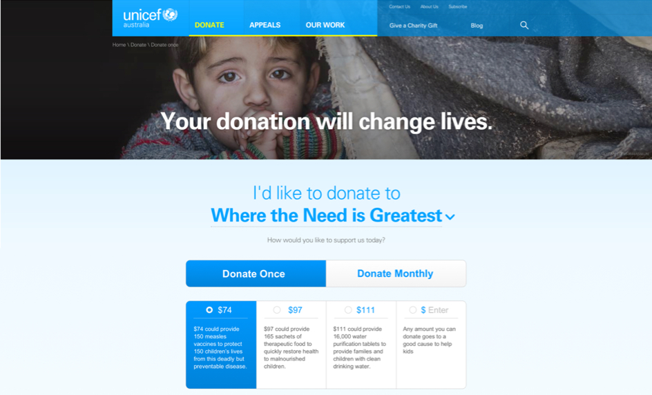
A number of these experiments demonstrated positive impact on the website’s engagement and conversion rates and were implemented, including changes to the various donation widgets used across the website.
While members of the UNICEF team were involved throughout the process, this report made it possible for the wider UNICEF team to benefit from the outcomes of the study.

A number of these experiments demonstrated positive impact on the website’s engagement and conversion rates and were implemented, including changes to the various donation widgets used across the website.
