To help their customers find the perfect gift from almost 4000 experiences and promote a user-centered design approach amongst their teams, RedBalloon decided it was time to redesign their site search.
I worked with the RedBalloon team to make sense of customer feedback, engage the team in designing a series of prototypes, and refine the solution through usability testing with RedBalloon customers.
Something for everyone
- RedBalloon
- UX Strategy, Prototyping, Usability Testing
RedBalloon is an online experience gift retailer based in Australia. Founded by businessperson, blogger, and entrepreneur Naomi Simpson in 2001, it offers a wide range of personal and corporate experiences, from relaxing getaways to adrenaline-fueled activities.
By early 2018, the number and types of experiences offered had grown substantially to almost 4000 experiences. At the same time, customer feedback suggested that it was becoming more difficult for customers to find unique experiences.

Our objective
RedBalloon wanted to redesign their site search to better showcase the range of experiences on offer, helping customers find the perfect gift. In addition, the team were looking to showcase a user-centered approach to design as part of a transition to new way of working - the result of a number of recent organisational changes including a new parent company, a new CEO, and a new platform. With limited internal resources and high stakes, RedBalloon looked to Oppo Studio to help steer the project to success.
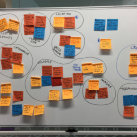
Reviewing a range of existing customer feedback surfaced pain points and opportunities for improvement, providing focus for the team.
My role
Working closely with RedBalloon’s product owners, I was responsible for the end-to-end project - from reviewing existing customer feedback and formulating an approach, to creating and refining prototypes through usability testing sessions.
Approach
I started with an immersive review of existing customer feedback - post-purchase survey responses, transcripts of customer support conversations and live chat, and informal usability testing conducted by the RedBalloon team - looking for common pain points and opportunities for improvement.
The criteria used by customers to evaluate an experience differed according to the type of experience they were interested in.
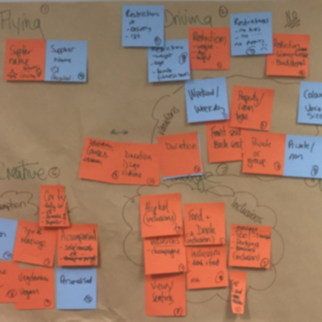
There was a clear distinction between customers who were looking for a specific type of experience, and those who were looking for inspiration. At the same time, customers looking for an experience they could enjoy had a different set of requirements to those who were looking for a gift. RedBalloon wanted to ensure that the solution supported each of these scenarios.
From the website analytics, there was a clear overlap in customer behaviour between search terms, categories, and locations. There was an opportunity to greatly improve the customer experience by being more flexible with how search terms were interpreted.
A series of recommendations were made following the initial review. These recommendations guided the subsequent prototypes.
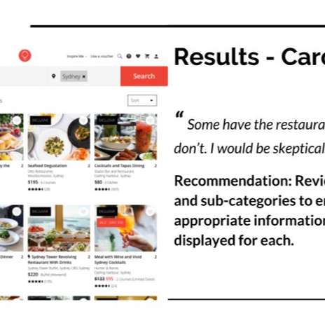
A series of prototypes were built exploring solutions to the riskiest areas of the design, and refined through usability testing with RedBalloon customers. We encouraged involvement from the wider RedBalloon team as much as possible in design workshops and reviews, as observers of usability testing sessions, and during recap sessions after each round of testing to discuss the results, and appropriate next steps.
Results
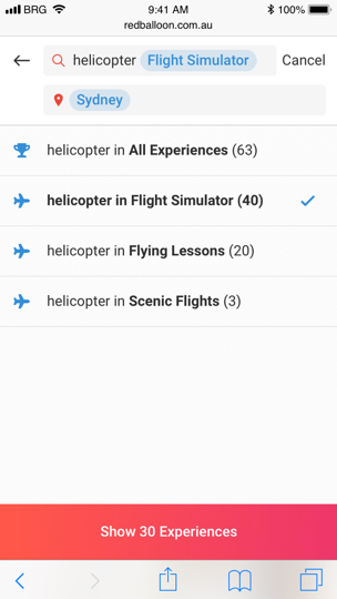
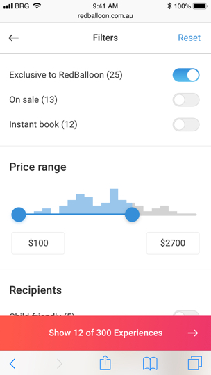
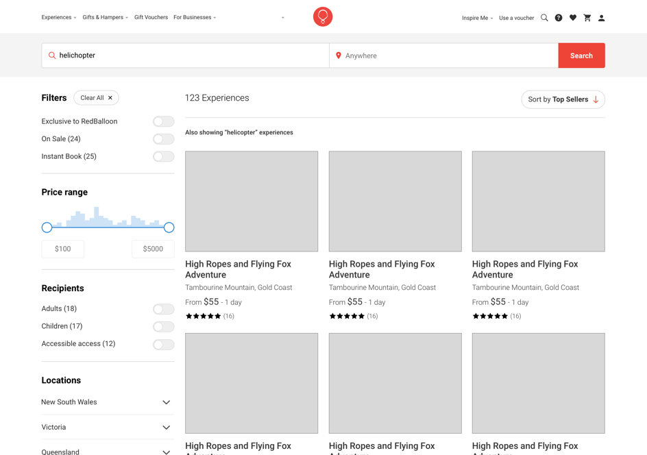
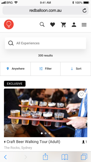
The resulting site search helps customers search across multiple categories and locations, understanding their preferences before refining the results to find the perfect gift (or personal indulgence). Experiences are presented so that the most important information (which differs depending on the type of experience you’re looking for) is available and easy to compare to find the best option for you. We also suggest possible filters and similar experiences to help customers manage the number of results they have to choose from.
Throughout the process, as the prototypes evolved and risks were addressed, we worked with the RedBalloon team to identify and begin refining UI elements, providing the opportunity for development to proceed at a much faster rate, forming the basis of a design library which can be incorporated across other RedBalloon projects.
UI elements were identified and refined as the prototypes evolved and risks were addressed.
